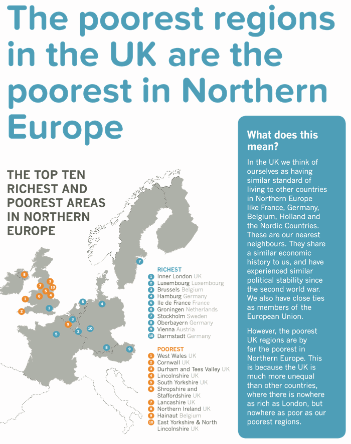
A few weeks ago the map below showed up in my twitter stream. It had been retweeted hundreds of times. At the time, I meant to write a post on the numbers behind the map. In particular, I wanted to take issue with what it tells us. According to the side bar: "The poorest UK regions are by far the poorest in Northern Europe. This is because the UK is much more unequal than all other countries, where there is nowhere as rich as London, but nowhere as poor as our poorest neighbours"
You can read this statement in two ways. One is simply providing the description of the map - we have very rich and poor regions so we are unequal. The other is to view it causally - the fact that we have high inequality explains why we have the poorest regions in Northern Europe. Unfortunately, the underlying numbers raise questions about both these interpretations (although the second one is particularly problematic).
Let's start with the claim that 'there is nowhere in Northern Europe that is as rich as London'. Unfortunately, this is not what the map shows. The map shows that INNER London has the highest GDP per capita calculated (on a PPS basis). This is three times the UK average. I find it worrying that people think this figure could possibly be correct. Of course, it's not for reasons that are a little, but not very, technical.
To see why this is a problem you need to know a little about how these statistics are calculated and something about the slightly weird geography of EU NUTS2 regions (on which the map is based). The GDP per capita figures allocate output on a workplace basis but population on a residence basis
The crucial issue is that Inner London is an administrative construct, not an economic one. That means that there is lots of commuting across the border of Inner London and, as the original data source makes very clear, "in some regions the GDP per capita figures can be significantly influenced by commuter flows. Net commuter inflows in these regions push up production to a level that could not be achieved by the resident active population on its own". That explains why the London figure looks so crazily high - because it ignores all the commuters who help produce inner London's output.
This is a bigger issue for Inner London than for some other rich EU areas. For example, according to the EU data that are used for this map, London has a population of 3m. In contrast, the Ile de France region has a population of 11m. All of this means that sensible comparisons need to correct for commuting - which I'll do the easy way by simply averaging Inner and outer London. This puts it on a par with Paris (at around 180% of the EU average) but below Luxembourg, Brussels and Hamburg. Of course, some of those regions probably need correcting to - but my point is that the data vastly overestimates London's income - and that you'd want to take account of that before reaching conclusions that 'nowhere is as rich as London'.
Next, is it the case that the UK is much more unequal than all other countries on this map? Here, the answer from the academic literature is that we are certainly more unequal. Whether we are much more unequal is open to debate. Regardless, does this level of inequality explain why the UK has the poorest 10 regions in this selection of Northern countries? It plays a part, but so too does the fact that we also have the lowest average GDP per capita (on a PPS basis). Indeed, the UK average level of income would rank it lower than the poorest Swedish region, poorer than all but a handful of Austrian, Finnish, Danish and Dutch regions (I count 6 in total) without any need to take in to account the level of inequality. In short we have lots of regions in the bottom 10 because we have both lower average income and higher inequality. There's no clean answer as to how much of this map is explained by low average income versus higher inequality. You could think of ways to try to get at it - taking, say, the level of inequality in other countries and applying it to the UK - but you certainly can't identify the separate role of average income and inequality on the basis of the map alone.
If you want an analogy, this is little like taking a primary school, finding that the ten smallest kids are in year one and attributing this to inequality amongst five year olds. [I'd be surprised to see hundreds of people retweeting that study].
One final issue is the use of GDP per capita in PPS. As the statistical note states: "GDP does not measure the income ultimately available to private households in a region" so I am not quite sure in what sense the map even shows 'poorest' and 'richest' regions. Worse, the PPS calculation is done at national, not local level. So this comparison is on nominal not real standards of living - so completely ignores the fact that London is a very expensive city relative to most other EU regions (including those in the UK).
In short, the map is a pretty misleading visual aid. Of course, we all use these kind of tricks to get people talking about important issues (like spatial disparities in the UK). The danger here, however, is that an awful lot of people (some of whom should know better) seem to take this map as showing that 1) London is the richest region in the EU; 2) High inequality explains why we have the poorest regions in Northern Europe. Unfortunately it does nothing of the kind.

